Using CSS Grid the right way
CSS Grid is robust, flexible, and a refreshing paradigm shift from other CSS layout systems. While these are selling points for Grid, they also make it hard to learn.
“Learning” CSS Grid requires developing working knowledge of many new properties that don’t just describe one aspect of appearance or behavior, but feed into a completely new layout system. This system includes around 18 properties which use paradigms and syntax rarely (or never) seen anywhere else in the CSS spec.
This means that CSS Grid has a pretty high skill floor — a developer needs to learn and internalize lots of new information in order to be effective with it. Once you’re above that skill floor, Grid is an amazing ally in layout creation. Below that skill floor, Grid is an encumbrance. You wonder why you’re bothering to use it at all, since it seems to require lots of additional work for little reward.
In this post, I want to help you overcome that skill floor by showing you the most effective ways to leverage the Grid spec. While I’m not covering the spec in its entirety — for something like that, see this CSS Tricks post — but what I cover here are, for me, the helpful aspects of this layout system.
Use names, not numbers
Grid columns and rows, at their most basic, are referred to by number. For example, this CSS sets up a grid with two columns and puts the page’s main content into the second column:
.container {
    display: grid;
    grid-template-columns: 1fr 2fr;
}

.content {
    grid-column: 2;
}
This works, but it misses an amazing feature of Grid: you can give your rows and columns specific names. You should take advantage of this whenever possible.
Here’s the same CSS, adjusted to use names:
.container {
    display: grid;
    grid-template-columns: [sidebar] 1fr [content] 2fr;
}

.content {
    grid-column: content;
}
Even in lightweight cases like this, it's to your advantage to name grid areas.
Benefits
Adding names to your grid brings a couple of major benefits.
Readability — Right off the bat, your code is easier to understand. Line 3 now describes everything going on inside of the Grid container. You’re not just listing out columns; you’re outlining the intent of each column.
Line 7 has also become more descriptive. Previously, we only knew that .content lived in the second column, which doesn’t mean much without more context — column 2 out of 3? 2 of 200? Assigning a column name, however, signals that this element has specifically been accounted for within the larger system. Naming also makes it easier to find the original column declaration, should we need to.
Future-proofing — Adding names makes your CSS more flexible. Specifically, you can iterate on .container without having to edit .content.
Want to swap the visual order of the content and the sidebar? Easy.
.container {
    display: grid;
    grid-template-columns: [content] 2fr [sidebar] 1fr;
}

.content {
    grid-column: content;
}
Want to add another column? No prob.
.container {
    display: grid;
    grid-template-columns: [related-posts] 1fr [sidebar] 1fr [content] 2fr;
}

.content {
    grid-column: content;
}
Without using named columns, you would have to update the column number in line 7 to reflect the changes made in line 3. Named columns give .content consistent behavior that’s independent of the column count or order.
Use fr as your flexible unit
CSS Grid introduces the fr unit, which tells an area to occupy some fraction of the total available space. While fr might seem like a sidenote within the Grid spec, it's actually indispensible.
The fr unit is different from % or vw because while the latter units describe portions of a 100-unit whole, frs are defined by the space not already used by something else. frs split up this space relative to each other.
Here, the content column is twice as wide as the sidebar column.
.container {
    display: grid;
    grid-template-columns: [sidebar] 1fr [content] 2fr;
}

.content {
    grid-column: content;
}
Since there are no non-fr units and three frs in total, 1fr = ~33% of the width of the grid.
Benefits
The fr unit offers a couple of things that other flexible units lack.
Readability and clearer intent — Using frs, unlike using percents, lets us stick with whole numbers that are sized relative to each other, not relative to a whole. This keeps the intended behavior clear. For example, line 3 is straightforward to translate into English: “The content is twice as wide as the sidebar”.
frs also let you divvy up space in ways that would be hard to calculate (and read) using percentages.
.container {
    display: grid;
    grid-template-columns: [sidebar] 3fr [content] 4fr;
}
Less math — The biggest benefit of the fr is that it takes the responsibility for doing exact arithmetic away from the developer and hands it off to the browser’s layout engine. For example, here’s a CodePen showing two ways to make the same layout using CSS Grid.
These lines are the crux of the demo:
.percents, .frs {
    display: grid;
    grid-column-gap: 20px;
}

.percents {
    grid-template-columns: repeat(3, calc((100% - 40px)/3))
}

.frs {
    grid-template-columns: repeat(3, 1fr);
}
The code on line 7 is hard to write, hard to read, and brittle. Any change to grid-column-gap or to our column count will break the layout, unless we manually update the column width to match.
Line 11 can ignore the gap size and won’t require new math if we update the column count. It’s easy to read and future-proof.
Don’t use a grid system
This contradictory-sounding recommendation extends beyond the CSS Grid spec and bleeds into how web design works and how developers interface with designers and their work.
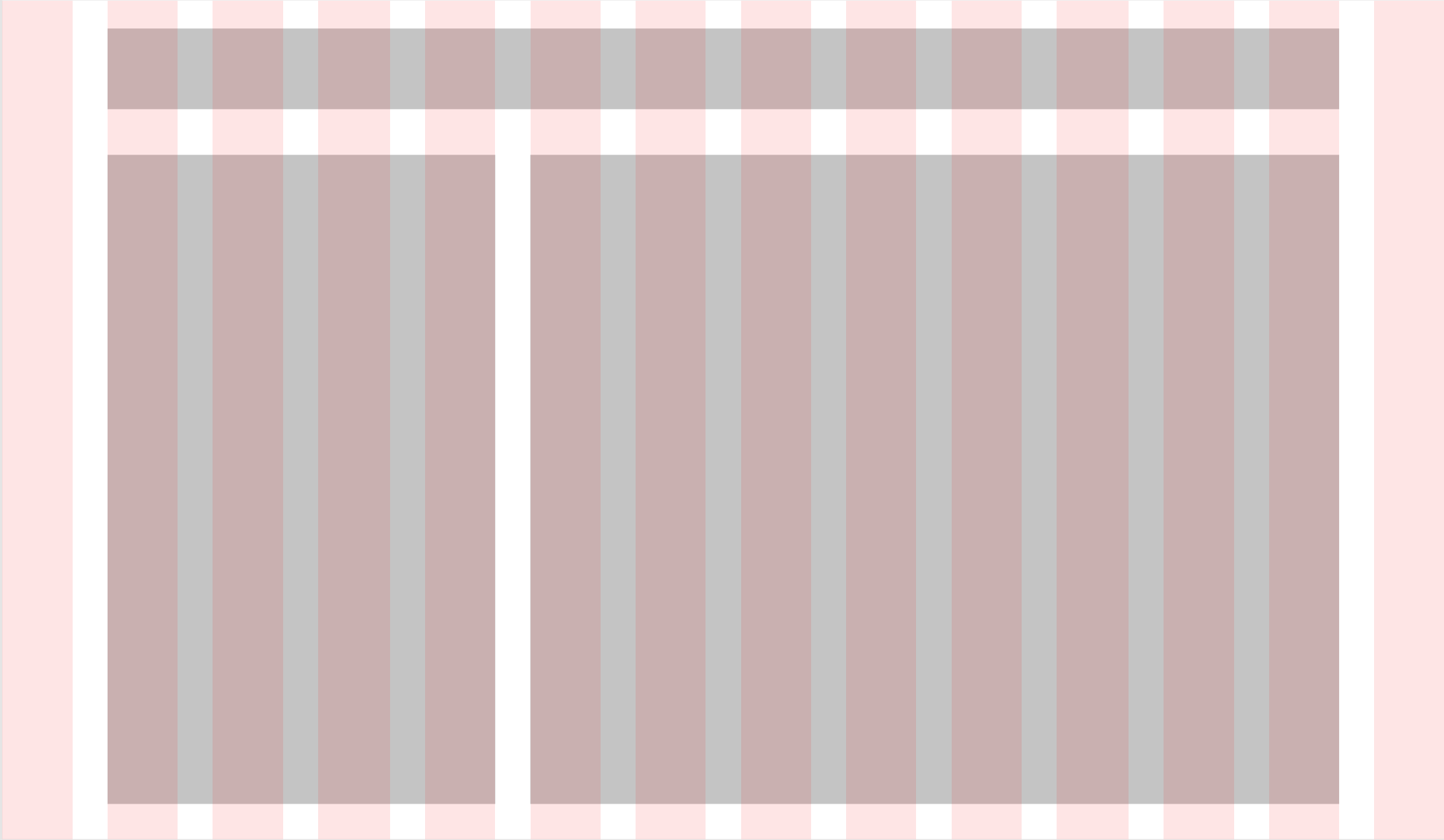
Layouts are often understood as elements aligned along a grid system.

Typically, development strives for exact parity with design. If designs are based on a 14-column grid, development will set up some kind of 14-column grid in code and write helper classes to make items span 1, 2, 3, 6, etc. columns. Most frontend frameworks, like Bootstrap, work this way.
In the above example, we have a 14-column grid, with these elements to place and size:
- The header, which starts at column 2 and spans 12 columns
- The sidebar, which starts at column 2 and spans 4 columns
- The main content, which starts at column 6 and spans 8 columns
In CSS Grid, it’s easy to set up a system that mimics the design:
.main {
    display: grid;
    grid-column-gap: 2rem;
    grid-row-gap: 1rem;
    grid-template-rows: [header] 100px [body] auto;
    grid-template-columns: repeat(14, 1fr);
}

.header {
    grid-row: header;
    grid-column: 2 / span 12;
}

.sidebar {
    grid-row: body;
    grid-column: 2 / span 4;
}

.content {
    grid-row: body;
    grid-column: 6 / span 8;
}
But is this actually a good plan? Our attempt at 1:1 reproduction has two drawbacks.
First, it foils our plan to name columns. Additionally, out of our 14 columns, we are only “using” columns 2, 5, 6, and 13. This technically works, but it suggests a bad signal-to-noise ratio.
Both of these problems are solved if we can take a couple of steps away from the original design:
.main {
    display: grid;
    grid-column-gap: 2rem;
    grid-row-gap: 1rem;
    grid-template-rows: [header] 100px [body] auto;
    grid-template-columns: [left-gutter] 1fr [sidebar] 4fr [content] 8fr [right-gutter] 1fr;
}

.header {
    grid-row: header;
    grid-column: sidebar / right-gutter;
}

.sidebar {
    grid-row: body;
    grid-column: sidebar;
}

.content {
    grid-row: body;
    grid-column: content;
}
Now instead of having fourteen columns, we only have four, but they still divide up the lateral space into fourteen parts. We have the exact same visual effect as in the first iteration, but our code is less noisy and directly reflects how it’s used.
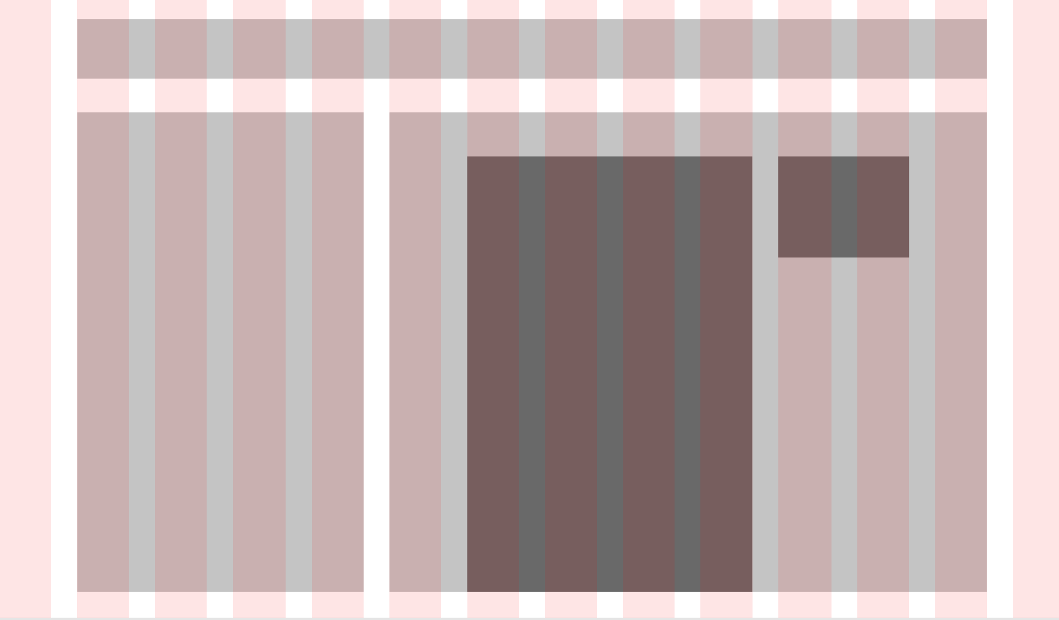
We can continue this paradigm throughout the layout. Say that within the .content element, we have a need for auxiliary information (an author bio, a blurb, etc.) next to the main article.

If we have adhered tightly to the 14-column grid, it appears that we need something like this:
.content {
    grid-row: body;
    grid-column: 6 / span 8;
}

.article {
    grid-column: 7 / span 4;
}

.info {
    grid-column: 11 / span 2;
}
Which will be tricky, since CSS Grid has no concept of inheritance. .info doesn’t know anything about the grid set up on .main, its grandparent element.
If we have let go of the literal 14-column grid, however, we may notice that .article and .info don’t need to know anything about the top-level grid — they’re part of a new grid inside of .content.
.content {
    grid-row: body;
    grid-column: content;
    display: grid;
    grid-template-columns: [left-gutter] 1fr [article] 4fr [info] 2fr [right-gutter] 1fr;
    grid-column-gap: 2rem;
}

.article {
    grid-column: article;
}

.info {
    grid-column: info;
}
Using this setup, .content is simple and internally consistent, but also aligns perfectly with our outer columns set up on .main.
Benefits
In addition to what I’ve already outlined, looser adherence to the original design system sets us up as developers to leverage our expertise and our tools — the browser — more effectively. Pixels and columns are less salient than relationships and proportional space.
It’s not significant that .article starts at column 7 and .info at column 11. It is significant that .article is twice as wide as .info. Thinking about elements proportionally and questioning how they interact with each other helps us treat layouts as dynamic systems.
Sidenote: Nesting Markup
One thing you may have noticed about the code samples in this section is the usage of left-gutter and right-gutter columns. This CSS assumes the most flat HTML possible.
<div class="main">
    <div class="header"></div>
    <div class="sidebar"></div>
    <div class="content"></div>
</div>
.main {
    display: grid;
    grid-template-columns: [left-gutter] 1fr [sidebar] 4fr [content] 8fr [right-gutter] 1fr;
}
If we are willing to put a wrapper div into the markup, we can write more direct CSS with fewer columns per element.
<div class="main">
    <div class="wrapper">
    <div class="header"></div>
    <div class="sidebar"></div>
    <div class="content"></div>
    </div>
</div>
.main {
    display: grid;
    grid-template-columns: [left-gutter] 1fr [wrapper] 12fr [right-gutter] 1fr;
}

.wrapper {
    grid-column: wrapper;
    display: grid;
    grid-template-columns: [sidebar] 1fr [content] 2fr;
}
The second approach feels inherently better because the math is simpler — you get to stop worrying as soon as possible about numbers that add to 14 and just think about a 1:2 ratio. This feels true to the spirit of CSS Grid.
What doesn’t feel true to CSS Grid, though, is adding the .wrapper div. Grid works hard to help us separate presentation from content — i.e., we don’t need to add extra elements to make the styling work or “behave nicely”. So, at least for today, I encourage you not to add or change markup for the sole purpose of cleaner CSS Grid styling.
Coda
Thanks for coming on this CSS Grid journey with me! I’ve been using and loving it over the past couple of months, and I hope this helps you understand and use it on your end 💐
To reiterate my points from the intro, CSS Grid is easy to use but difficult to learn. It’s a more intuitive paradigm than any other CSS layout technique, but it’s completely different from its predecessors.
All this to say: take Grid as slowly as you need to. Don’t try to understand it all just from reading the spec. Set up simple examples, pop open that web inspector (especially in Firefox!), and be kind to yourself.
It’ll be worth it.
Changelog
- 3/1/2020: Fixed column typo (#5)